While gaining my professional experience, I realized one very important thing. If I try to summarize it in few words, I would say that by focusing on users first, you will be able to create an interface that lets them to complete their tasks easily and efficiently. Comprehending the needs of a user is paramount. Everything else follows. To make it easier to understand the way I work, I will describe the project that I have done recently for: CEROX MONITOR APPLICATION FOR ORNIM MEDICAL INC.This is an CerOx monitor application for medical Ornim Inc. ( http://www.ornim.com ) that develops a non-invasive, multi-modal monitoring platform for measuring vital physiologic parameters. Ornim's FDA cleared devices enable continuous and safe monitoring of brain tissue oxygen saturation.Ornim's CerOx monitor is simple and easy to use. It consists of a stand-alone bedside unit that provides a user-friendly graphical display of current and historical patient data from two independent sensors. The sensors are coupled to the skin using a single-use adhesive pad. 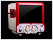 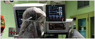 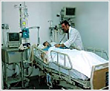 |
| Step 1 - Learning User Scenarios (Draft) |
| Users: | Nurse, Doctor / Anesthetic, General Technician, Ornim Technician |
| Working Environment: | NICU, OR, Trauma Unit |
|
Main Analysis: Notes & guidlines
|
• Different light conditions will require a bright text on dark background interface • Work distance (Implications on font size): Monitoring – up to 2M, operating – 70-100 cm • 3 Different types of users that may not use the system’s features frequently – designing a system which is suitable for novice users • Users with color disability (color blindness) that may use the system’s features • Providing the user with a feeling of “control” in every moment and supporting his decision making |
|
Operating Mode: Touch screen cons
|
Cons: • Screen may get dirty In some cases there is a “waist” of screen footprint. • Control size must be minimum 10X10mm with a distance of 3mm between the elements – therefore, less elements may be inserted into the interface • Requires work with bear hands or with sensitive gloves (The touch screen must be suitable for work with latex gloves) • Less suitable for precise selections – currently not relevant for our system |
|
Operating Mode: Touch screen pros
|
Pros: • Direct manipulation simplifies operating of the system and gives a clear understanding of labels and operations, and is suitable for novice users, as a result • Easy & Cheep when changing versions – The main action buttons are changeable in no. , size, location and order • Is good for “selection” operations • Enables more operations on a primary level |
| Touch screen: | • Size 8.5” – minimum reqirement (we recommend a larger size for future purposes) Comment: The concept design is based on the recommended standards and recommended types of interaction for use with touch screen systems . |
|
It is important to notice that at this stage my participation as a designer is not always required, since it is mostly UI specialists' field of expertise. However, I use to take part in discussions on a particular project, since my design is the final step before implementation, and it is important for me to understand user requirements, as soon as possible. So, after the user requirements discussion the wireframe of the main window was made |
 |
| Step 2 - Look and Feel | |
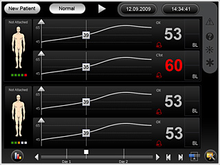
| Once the wireframe is agreed on, it's time to design. At this point I go out on the stage to continue the show. Typically, I meet customer for the joint interview. It is very important to understand the way customer sees the final product. There are tools that can help, for example PPT presentations with examples of my other works and screenshots of well-known trends. Here you can see the couple of my designs, till customer has decided which one he wants. | |
  | |
  | |
|
I chose a black background, since: It is about patients' life, so user's immediate reaction to any change in vital signs is critical. The background color should not distract users from monitoring task. Orange was chosen as a contrasting color to draw user's attention to the data. Since touch screen is used, user must clearly see where he is at the current moment. Also, orange color is the most contrast one out of the warm colors, and people with color-blindness can see it clearly (we used the red color to identify alarms and emergency situations). As it can be seen from the examples above, I made several sketches, using blue as a contrasting color. This was done due to the request of the customer and in order to persuade him not to use this color in the application. The reason behind it is that on the black background and in the room, which is not always illuminated, it may be difficult to see the data on the display without any additional efforts of the eyes. The screen is divided into 2 groups, both functionally and visually. The first group includes elements of screen data management , which are made in light gray color as the bleached version of black. It was done for consistency reasons. The second group includes controls of the device itself, such as battery failure icon, help icon, grid, scale, markers, options icon, date and time etc. These elements are unified into one group and emphasized either by orange color or unique background. Choosing colors for this application was based on customer requirements, user experience, color limitations, and my experience in working with this type of applications. So, after several changes, the customer choosed the "orange" version. By the way, I did like it a most of all versions, because sufficient contrast between the black and orange. To work with this application will be a pleasure, because it meets the customer requirements, does not overload the eye and still looks elegant.  Also, I had to show how the screen will look like to color-blind, with protanopia and deuteranopia, which are the most widely spread forms of color blindness, collectively called red/green blindness. (There are, in fact, significant differences in their effects, but those differences have no real effect on interaction design.) While tritanopia is far more rare, it nonetheless rules out dependence on yellow-blue differentiation without secondary cues.  Deuteranopia test 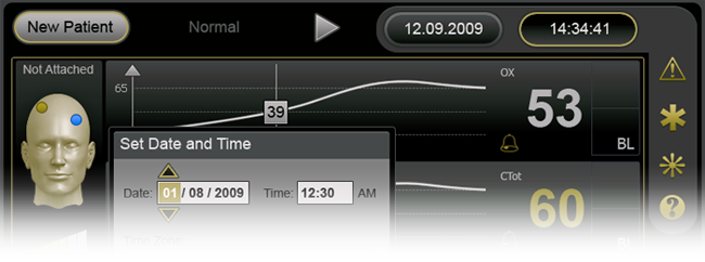 Protanopia test  Tritanopia test | |
| Step 3 - Detailed Design | |
| This phase is less complex in terms of innovation in design, but most intensive in terms of work on the application. Pop-up windows, icons, menus, additional screens must be designed at this stage. All of them must be consistent with already chosen design concept. A consistent interface makes users to understand better how things will work, increasing their efficiency and preventing them from making mistakes. So the final product looks like this: | |
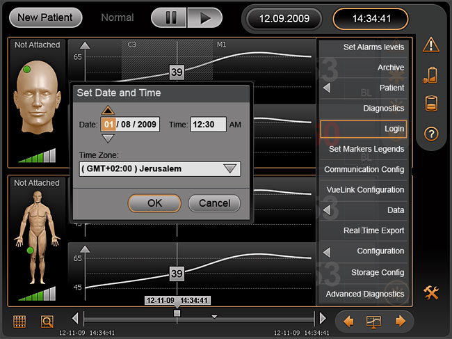
Cutting is not as much interesting as the design, but it's going to come for sure. If we want a product to look exactly like it was coined, it must be properly implemented. Actually, this is the headache of programmers and technicians, but basic elements of the mockup like buttons, radio buttons, checkboxes, text boxes, scrolls, backgrounds, fonts and fonts color, etc. should be provided by designer and must be sliced precisely as they have been designed. So, this is more or less what happens to me when I'm working on a project. For some this may seem boring, but I like this process. I like to see the finished product that works and look exactly how I designed it, I like to see customers thanking me for the excellent work and I like to see that users can easily use the application. This means that the work was done professionally! | |